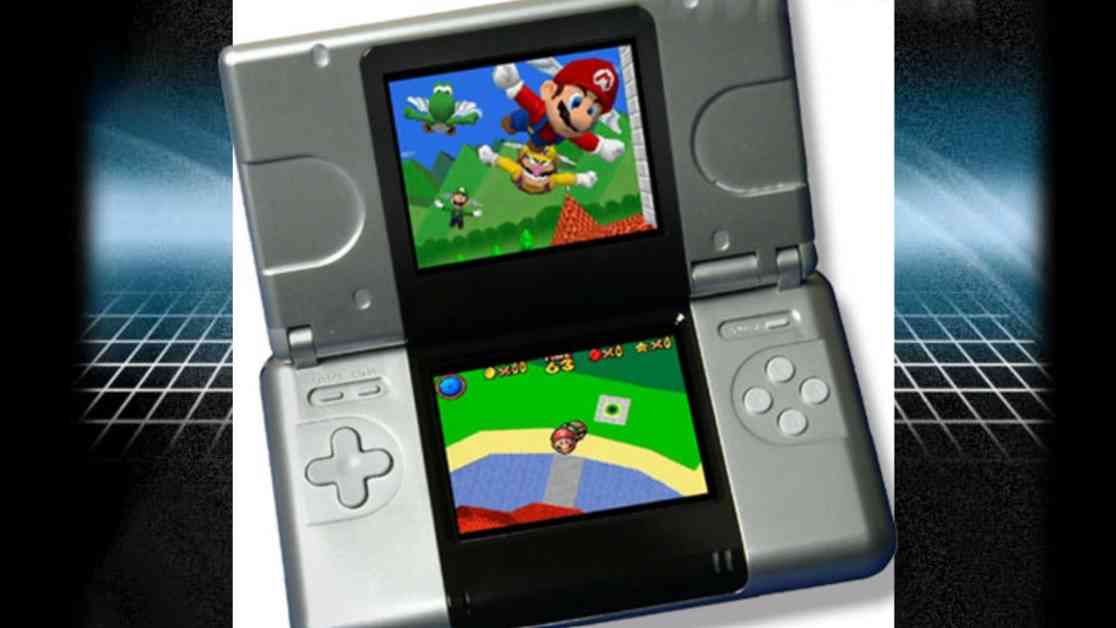
It’s hard to believe that it’s been two decades since the Nintendo DS made its debut, and even longer since the prototype was unveiled by Reggie Fils-Aimé at E3 2004. Many prospective customers at the time were not impressed with the design of the device, with some even going as far as to call it clunky and cheap. This sentiment was further amplified by the sleek and sophisticated design of Sony’s PSP, which was also revealed that year.
However, in my opinion, the DS prototype was not as unattractive as some may have believed. Personally, I was captivated by the innovative concept behind the DS when it was first showcased at E3. The design of the device was not my primary focus at the time, as I was more interested in experiencing the new handheld gaming experience it promised to deliver.
While the final redesign of the DS, particularly the DS Lite, was undoubtedly more aesthetically pleasing, there is something about the original prototype that still appeals to me. Its retro-futuristic appearance, with its chunky yet smooth design and unique dual-screen layout, gives it a nostalgic charm reminiscent of sci-fi movies from past decades.
But what do you think? Do you find the DS prototype ugly, or do you appreciate its unique design? Should Nintendo have stuck with the original design, or were they right to redesign it? Share your thoughts by participating in the poll and feel free to leave a comment to elaborate on your opinion. Let’s celebrate 20 years of the Nintendo DS by reflecting on its design evolution and the impact it has had on the gaming industry.


